Case study·● Live site
Swansea Women's Aid: a research-led redesign
A full redesign for a local domestic abuse charity, built around three audiences with very different needs, and very different amounts of time to find what they need.
The Challenge
A site that had to work for three audiences at once: women seeking help, often in crisis; donors and funders; and volunteers. The existing site buried the helpline below twelve nav items, and staff had no way to update content without developer help.
The Solution
Navigation rebuilt around the three priority audiences, crisis support first. A visible "quick exit" safety feature, plain-language guidance on recognising abuse, and a lightweight CMS for the team to publish without developer help.
- Many women weren't sure whether what they were experiencing qualified as abuse.
- The existing site was hard to navigate, with no clear structure per audience.
- Staff had no way to update content without developer support.


● Updated September 2026
Continued iteration: a full UX review and refresh
The site had been rebuilt in a hurry after an accidental content loss, so parts were never finished. I went back through it: fixing what hadn't been properly rebuilt, tightening the design, reorganising key journeys in plain English, and completing a full WCAG 2.2 AA accessibility pass, while keeping the charity's existing branding.
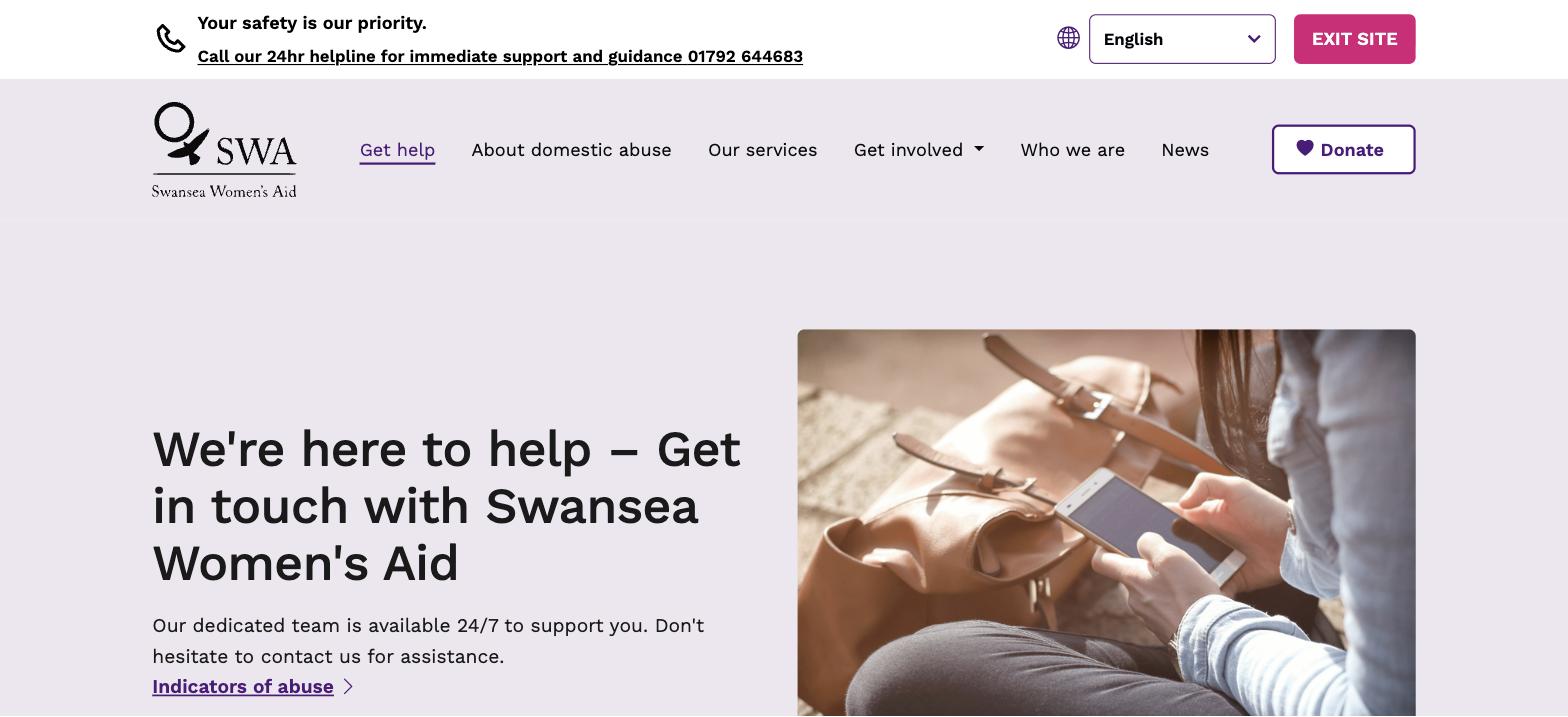
- A rebuilt, back-button-proof safety exit, and a Get help page with two clear actions.
- Navigation and services reorganised in plain English, replacing internal acronyms.
- A full WCAG 2.2 AA pass, plus a Welsh and community-languages menu.
- Consistent design across desktop and mobile, with compressed images for faster loading.
- CMS and forms fixed, including a Get involved form that reaches the team.
Case study·● Live app
Sober Points: finding sober-friendly places
Product design · UX research · Interaction design · Prototyping · Usability testing
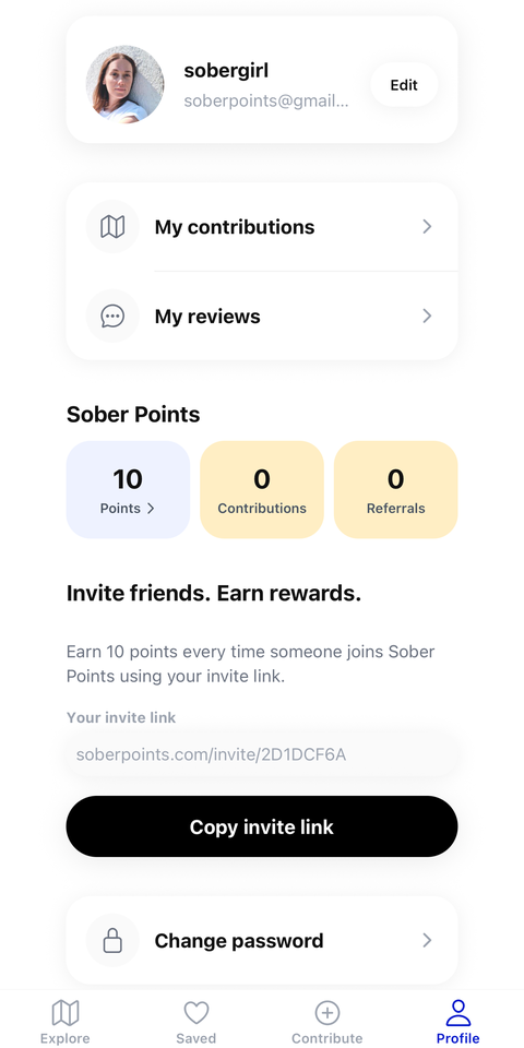
Sober Points helps people find places where choosing not to drink doesn't mean compromising on the experience. I founded the product and led its design from early research through to a live web platform and native app.
The Challenge
Finding somewhere to eat or socialise is easy. Finding somewhere genuinely good when you're not drinking is harder: information about alcohol-free options is often incomplete, buried in menus, or unavailable until you arrive.
The Solution
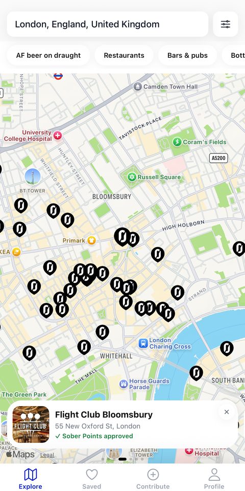
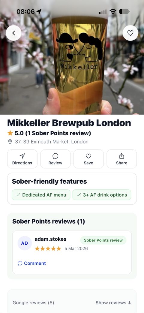
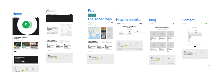
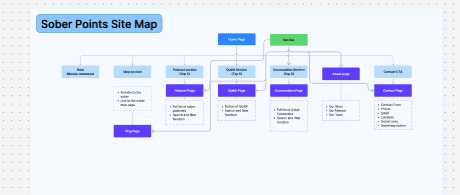
A focused discovery tool, mapped end-to-end rather than designed screen by screen: search by location, filter results, then open a venue profile with alcohol-free options and community reviews.
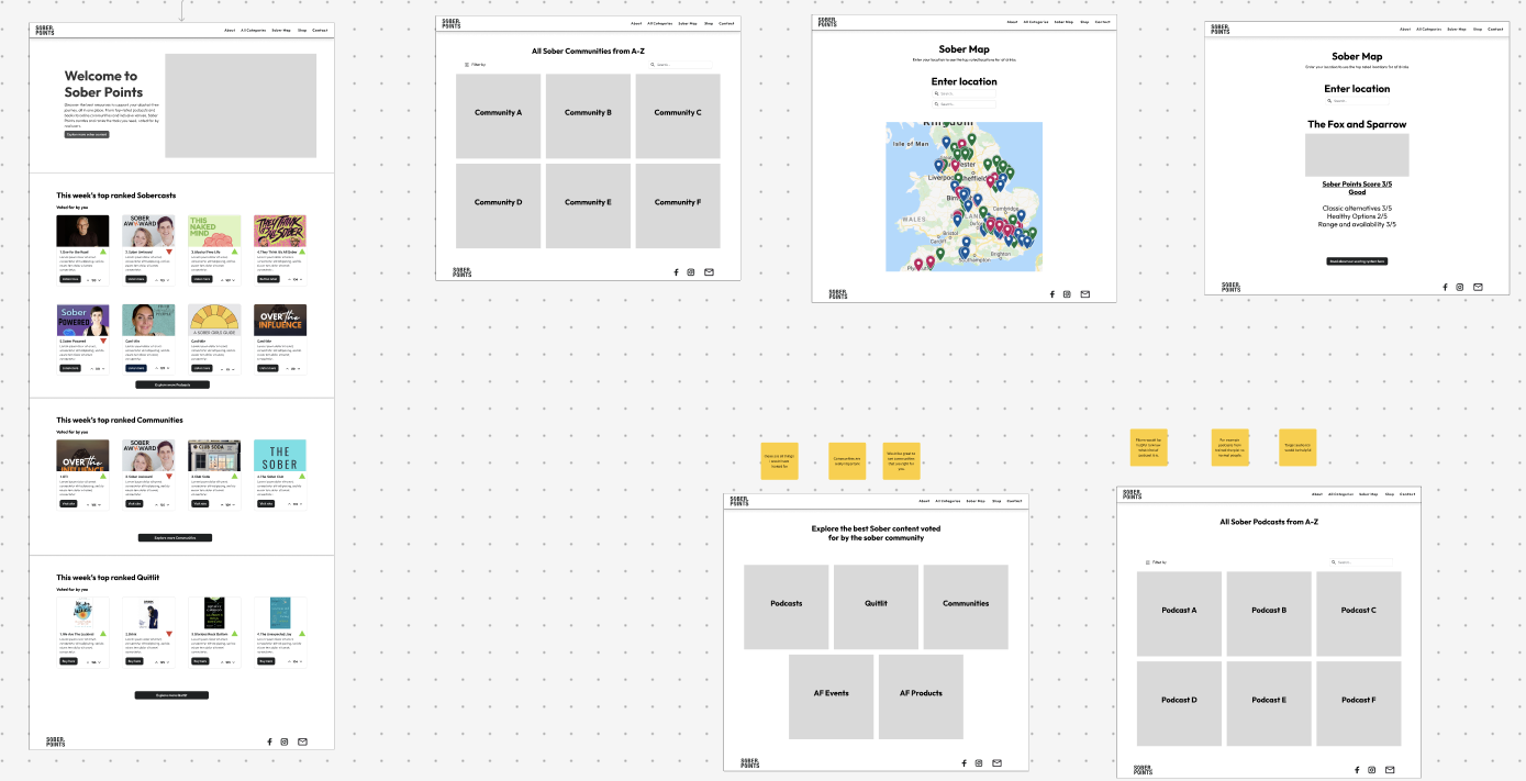
- Early concepts explored a much broader sober-living ecosystem: communities, podcasts, events.
- Usability testing on those concepts repeatedly surfaced the same thing: people didn't want another community platform, they wanted a fast, trustworthy answer to "where can I go near me?"
Designing a two-sided service
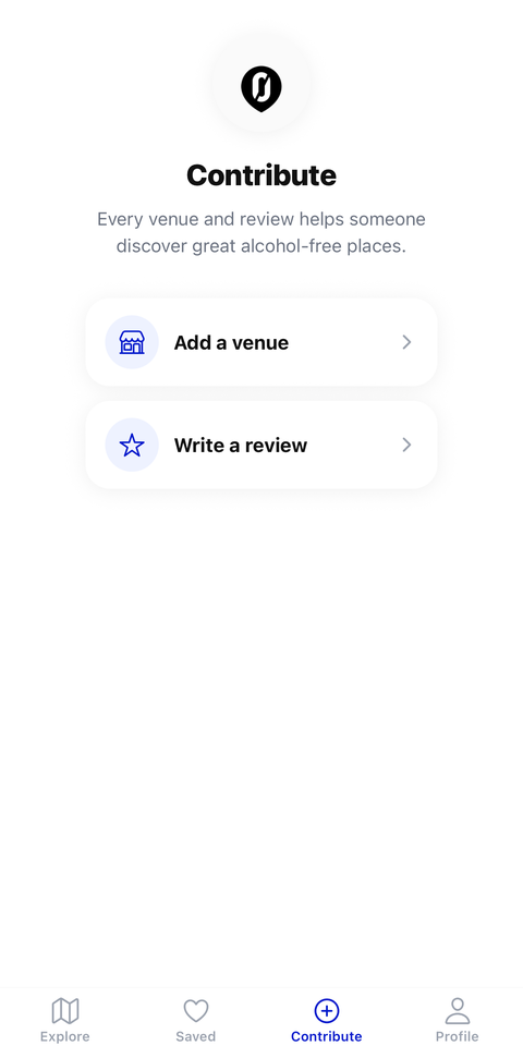
Because the product depends on the quality of venue data behind it, I designed contribution, moderation and venue-claiming journeys alongside the consumer experience, then used product analytics and qualitative research after launch to prioritise what to fix next. One recurring lesson: venue type and venue attribute don't belong at the same level, and treating them as equivalent filters created a confusing hierarchy as the dataset grew. Separating them was a small change that showed how the information architecture has to evolve as a product matures.
From web product to native app
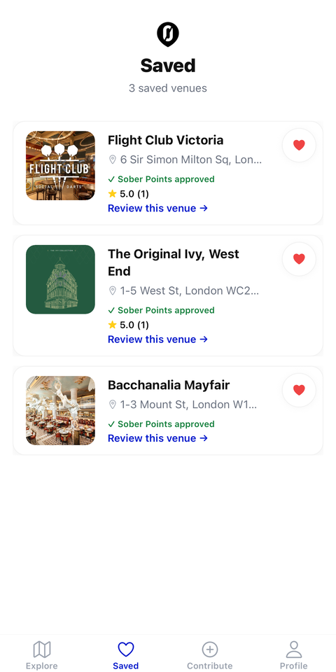
As the product developed, I translated the experience into a native mobile app: not a visual port of the website, but a rethink of map behaviour, navigation, authentication, saved venues and deep links. It's now a live product with hundreds of sober-friendly venues and real users searching and contributing.